Gnome Power Notifications ( lemmy.world )

cross-posted from: https://lemmy.world/post/14158942

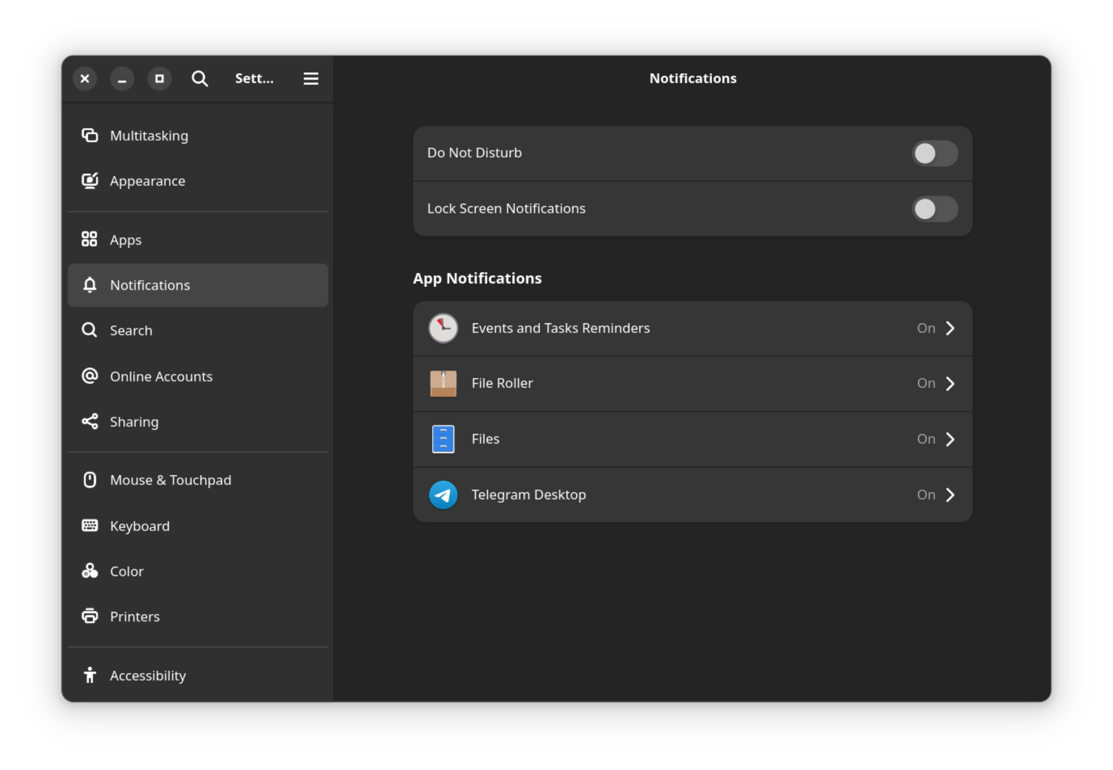
I did a minimal Fedora 40 installation on my Thinkpad, so it's possible I missed some package... I don't have the Power entry in the notification settings; need that one to turn off the absolutely inane notification that the laptop's about to suspend.

Searched dnf for anything resembling power, came up short. Any idea what to check for?

possiblylinux127 ,
@possiblylinux127@lemmy.zip avatar

It should be on all the time

redcalcium ,

Not sure if it's possible on the latest version of gnome anymore. Maybe try turning off lock screen notification because those sleep warning notification would often shows up when the screen is already locked?

barbara ,

Wow, those buttons in the upper left look bad 😂
Luckily you can hide them gsettings set org.gnome.desktop.wm.preferences button-layout :

Sorry for hijacking

enviousCardinal OP ,

you mean that they're on the left or what...? like 'em just fine there, I'm a macOS convert.

federalreverse ,

You can't even read the title of the window properly, and it's a short one! And there's this ugly scramble of icons all clustered on the left. This may work and you may be used to it but Gnome is certainly not designed to be used like that.

Hiding all the buttons as the poster above told you to do is worse though.

enviousCardinal OP ,

yeah, the over-crowdedness is only in the settings app, "normal" apps look fine

barbara ,

Why is it worse? On desktop there are shortcuts and on touch there are gestures. Those buttons are a relict from the last millenium

aleph ,
@aleph@lemm.ee avatar

Because a significant number of people still interact with the desktop via mouse rather than keyboard shortcuts.

Hell, I use hot keys for most things but I still often prefer to quickly minimize a window with the cursor instead of reaching across the keyboard. The first thing I do with a vanilla Gnome installation is get Tweaks on there and restore window buttons.

lemmyvore ,

Unfortunately that's baked into all GTK apps nowadays. They merged the window bar and the window toolbar and now depending on how busy the app interface is you'll get an unholy mess in some apps.

Plus there's no longer any rhyme or reason to the layout even in apps without overlap. Previously you used to have a clear separation between window controls, app menu, and app toolbar. Now it's all jumbled.

I'm not even sure I understand what was the motivation since the screens and resolutions are getting bigger not smaller. But they still could have find ways to do it better, for example come up with a wrapping system that would put titlebar, menu and toolbar side by side (but still distinct) where the space allowed, and wrap them when it didn't.

barbara ,

It doesn't matter if they are left or right but it should fit into the window. Literally fit into it, it doesn't. And the icons are off. Either use circles for all, or don't. And by now there is a consistency gap. In settings, the main window is the sidebar whereas in nautilus it's just a sidebar and not the main window.

enviousCardinal OP ,

the circles and whatnot, I didn't customize nothing there; minimal gnome shell install, activated the max/min buttons and moved them to the left. why I need them and need them there isn't important.

  • All
  • Subscribed
  • Moderated
  • Favorites
  • linux@lemmy.ml
  • random
  • All magazines